Color Identifier From Photo
Upload a photo and get the colors in it named, coded, and grouped into a palette.
What the Color Classifier does
Trying to describe a color to a paint store, a designer, or a client from memory rarely goes well; "kind of a dusty pinkish orange" is not how paint codes work, but that's usually how the description starts. This tool takes a photo and breaks down every color it can identify: named shades like sage green or crimson red, along with hex, RGB, and HSL values you can paste straight into design software. It groups similar tones, calls out the dominant and accent colors, and notes whether the overall feel reads warm or cool. Useful for matching paint, pulling a palette for a design project, or just satisfying curiosity about what's actually in a photo you like.
See a sample result
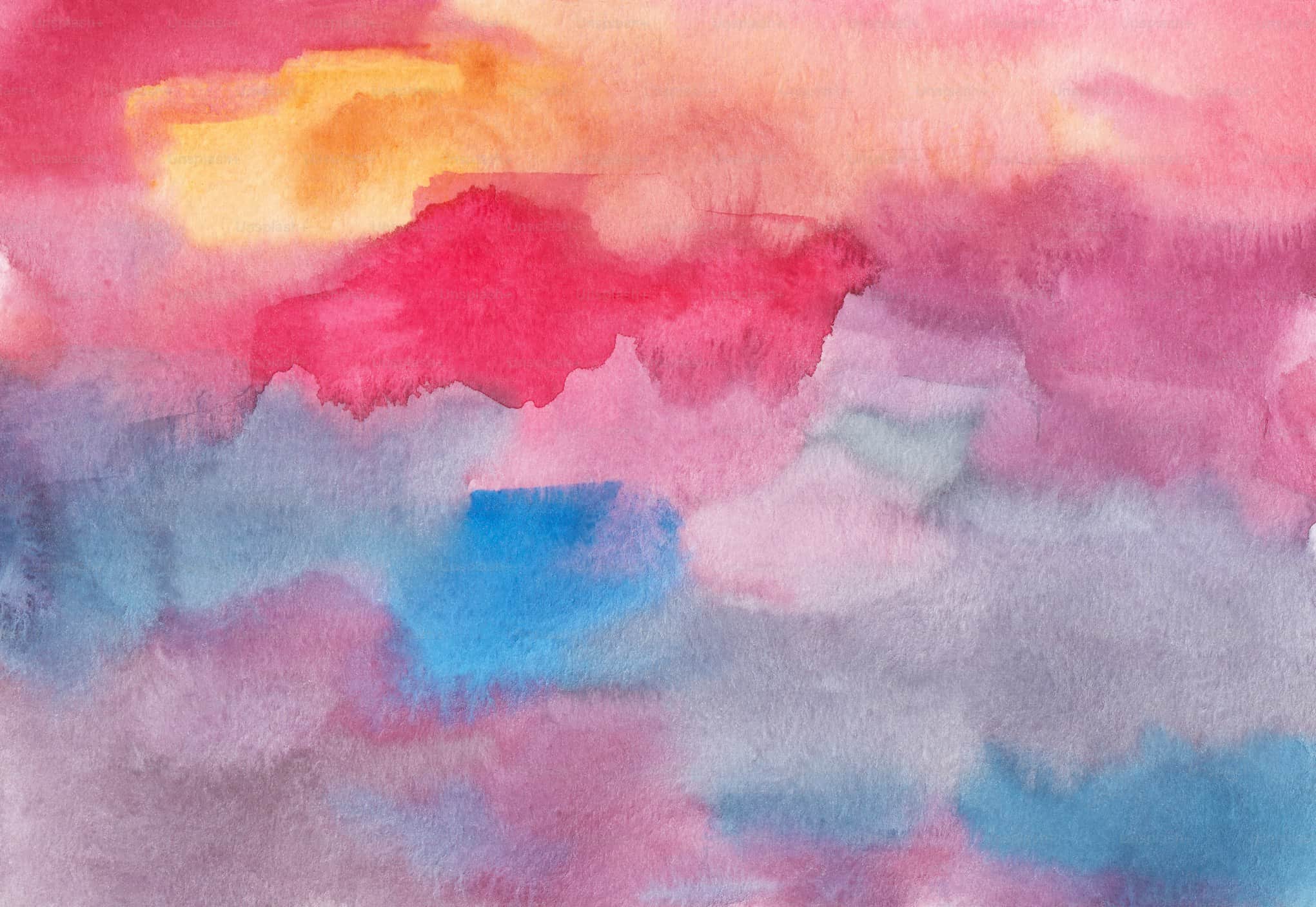
Input: An abstract watercolor wash on paper: bands of raspberry red and warm peach at the top, pinks and mauves through the middle, a bright blue patch, and soft lavender-gray and blue washes along the bottom.
- Pink and rose38%
- Lavender gray24%
- Red14%
- Blue14%
- Apricot and peach10%
Overall read: A soft, mostly warm palette of pinks and reds over a cooler lavender-gray base, with two blue accents that give the eye somewhere to land. Colors bleed into each other, so each value below is taken from the most saturated part of its area.
Dominant colors
- Rose pink, #E58CA8 (RGB 229, 140, 168; HSL 342, 64%, 72%): the upper-middle band and most of the right side.
- Lavender gray, #A79DB6 (RGB 167, 157, 182; HSL 264, 15%, 66%): the lower third, where the pigment has thinned out.
Accent colors
- Raspberry red, #D63A5E (RGB 214, 58, 94; HSL 346, 65%, 53%): the sharp-edged shape in the upper center.
- Cerulean blue, #2F86D0 (RGB 47, 134, 208; HSL 208, 63%, 50%): the bright patch left of center.
- Apricot, #F4B35E (RGB 244, 179, 94; HSL 34, 87%, 66%): the warm glow in the top left.
Harmony and temperature: Pinks, reds and apricot sit next to each other on the wheel (analogous and warm), while the cerulean sits far across the wheel from them, which is why it pops. The paper's texture and the scan lighting soften everything slightly, so treat the hex codes as close estimates.
Palette idea: Rose pink as a background, lavender gray for text or secondary areas, and cerulean used sparingly for buttons or highlights.
How it works
- 1
Upload a photo with the colors you want identified
Product shots, interiors, fabric, nature scenes, or artwork all work. Even lighting helps the tool read true colors rather than colors skewed by shadow or glare.
- 2
The AI extracts and names the colors present
It identifies dominant and secondary colors, assigns descriptive names, and pulls hex, RGB, and HSL values for each, then groups similar shades together.
- 3
Ask about a specific area in the details box
If a photo has many colors and you only care about one object or region, mention it ("just the chair" or "the sky in this shot") to narrow the focus.
- 4
Get named colors, codes, and a palette summary
The result lists each identified color with its name and codes, notes the color temperature and distribution, and suggests how the colors work together as a palette.
Use cases
Match paint or fabric to a photo you love
Get a hex or RGB starting point from a photo of a room, outfit, or object before heading to a paint store or fabric shop, so you're matching a code instead of a memory.
Pull a palette for a design or branding project
Designers can upload a mood photo and get named colors and codes to build a palette around, instead of eyeballing shades from a screenshot.
Check color consistency across product photos
Sellers and photographers can compare the extracted colors across several shots of the same product to catch lighting inconsistencies before listing them.
Learn color names and relationships
Students and hobbyists can upload artwork or photos to see how professionals name and categorize color, including how tones relate to each other on the color wheel.
Tips for better results
- Shoot in even, natural light; strong shadows or colored lighting will shift the hex values the tool reports.
- Avoid photos with a heavy filter or color grade applied if you want the true color of the object underneath.
- Get close enough that the surface fills most of the frame if you only care about one item's color.
- Mention the specific object or area in the details box when a photo has many colors competing for attention.
- Cross-check a critical color match (like paint for a wall) against a physical swatch, since screens and cameras render color differently.
Frequently asked questions
How accurate are the hex codes it gives me?
They're a close visual estimate based on the pixels in your photo, not a calibrated color reading. Lighting, camera settings, and screen calibration can all shift the actual color slightly from what's reported.
Can it identify colors in old or faded photos?
Yes, but it will describe the colors as they appear in the photo, which may be faded or shifted from the original color of the object due to age, scanning, or lighting at the time.
Does it work on paintings and illustrations, not just photos?
Yes, it identifies and names colors in any image, including digital art, paintings, and abstract compositions, the same way it would a photo.
Can I get a full palette instead of just the main color?
Yes, the default result covers dominant and secondary colors together as a palette, with codes for each so you can use more than one shade.
Why does it call one color 'warm' and another 'cool'?
That's based on where each color's hue falls in relation to red and orange (warm) versus blue and green (cool), which affects how a palette feels even when the colors are otherwise unrelated.
Plans start at $9 a month. See pricing