AI UI Review and Design Analyzer
Upload a screenshot, mockup, or sketch and get written feedback on layout, hierarchy, and usability.
What the UI Design Analyzer does
Getting design feedback usually means waiting on a coworker or paying for a review call, and sometimes you just want a second opinion right away. This tool looks at a screenshot, mockup, or hand-drawn wireframe and breaks down what's working and what isn't: layout and spacing, visual hierarchy, color choices, typography, and how clear the interaction patterns are. It's for designers checking a draft before a client call, developers building without a designer on hand, and students learning to spot what makes an interface easy or hard to use. Add a note if you want it to focus on one screen or one concern.
See a sample result
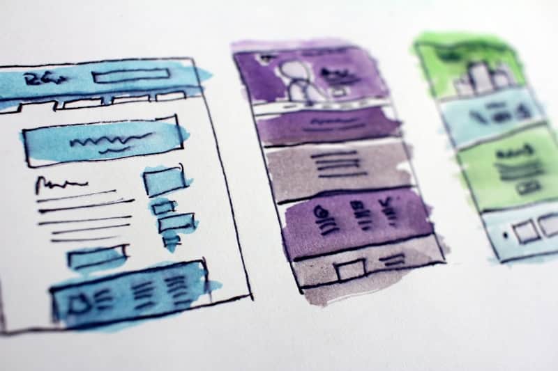
Input: A hand-drawn wireframe sketch in ink and watercolor showing three separate screen layouts side by side: a website layout in blue tones with a header, a hero banner, a body of text lines, and a footer with buttons; a mobile app screen in purple and gray with a profile section, a list of rows, and a bottom action bar; and a second mobile app screen in green with a small illustration at the top (it could be a skyline), rows of content, and small icon buttons at the bottom.
- Layout Clarity68%
- Visual Hierarchy55%
- Usability Signal60%
Overall impression: These read as early-stage wireframes exploring three different layout directions rather than finished screens, which is a reasonable way to compare structure before committing to visual style.
Website layout (blue): The header, hero banner, and footer follow a familiar top-to-bottom pattern that most visitors will recognize instantly. The row of text lines in the body reads as placeholder content, so hierarchy there is hard to judge yet; once real headings and body copy go in, keep at least one clear visual break between sections.
App screen (purple): The profile block at the top followed by a list of rows is a common and workable pattern, but the row spacing looks tight in the sketch. If the rows contain tappable content, add enough vertical padding between them to avoid mis-taps on a real device.
App screen (green): The illustration at the top works as a hero image, and the stacked content cards below are easy to scan. Icon-only buttons without labels can be ambiguous, so plan to add short text labels or confirm the icons are already familiar to your target users through testing.
Next step: Pick one of the three directions and build it out with real content and spacing measurements rather than refining all three sketches in parallel.
How it works
- 1
Upload a screenshot, mockup, or sketch
Finished screens, Figma exports, and hand-drawn wireframes all work. Multiple screens in one image are fine if the layout stays fairly clear.
- 2
Add a note if you want a specific focus
Ask it to focus on color, hierarchy, or a single screen, or leave it blank for a general pass across the whole image.
- 3
The model reads layout and design choices
It looks at spacing, alignment, visual hierarchy, color and contrast, typography, and interaction cues like buttons or navigation elements.
- 4
You get specific, written feedback
The result names strengths and problem areas by section, so you know exactly what to change rather than getting a vague overall impression.
Use cases
Sanity-checking a design before a client call
A freelance designer uploads a mockup the morning of a presentation to catch spacing or hierarchy issues before the client sees them.
Getting feedback without a design team
A developer building their own product uploads a screen they built and gets notes on usability gaps a non-designer might miss.
Comparing early wireframe directions
A team sketches a few layout options on paper, photographs each one, and uses the notes to decide which direction to build out first.
Learning design fundamentals
A student studying UI design uploads screenshots of real apps to see how a trained eye would break down hierarchy and layout choices.
Tips for better results
- Crop the image to the screen or sketch itself so stray background clutter doesn't confuse the analysis.
- Upload a higher-resolution image when possible; small or blurry text is harder to assess for readability.
- If you're comparing multiple screens, keep them clearly separated in the image rather than overlapping.
- Name your target audience or platform in the notes field for feedback that fits the actual use case.
- Run a redesigned version through afterward to see whether the specific issues raised were actually addressed.
Frequently asked questions
Does it work on hand-drawn wireframes, not just finished screens?
Yes, it can read hand-drawn sketches and low-fidelity wireframes, though feedback on fine details like exact spacing gets more precise with a clean digital mockup.
Can it check accessibility issues like color contrast?
It can flag obvious contrast or readability concerns it sees in the image, but it isn't a substitute for running an actual accessibility audit tool against your live code.
Will it tell me if my design copies another app too closely?
No, it doesn't compare your design against other products or check for originality; it evaluates the layout and usability choices in the image you upload.
Can I upload multiple screens in one image?
Yes, as shown in the example, several screens side by side work fine, though feedback may be more specific if you upload one screen at a time.
Does it give feedback specific to mobile versus desktop?
It reads the layout as shown, so mention the target platform in the notes field if the screenshot doesn't make it obvious.
How is this different from a real design critique?
It gives a fast, structured first pass based on common design principles, but it doesn't know your users, brand, or business goals the way a human reviewer would.
Plans start at $9 a month. See pricing