Text Readability Analyzer
Check contrast, spacing and legibility of any text inside an image before you send it out.
What the Text Readability Analyzer does
A flyer that looks fine on your monitor can turn unreadable once it's printed, photographed under bad light, or viewed by someone with low vision. Upload an image and the AI reads the text inside it, whether it's a screenshot, a scanned page, a sign, or a photo of handwriting, and assesses how legible it actually is: font size and weight, color contrast against the background, spacing, and anything obstructing the text. It's built for designers checking a slide or poster, teams reviewing accessibility on marketing images, and anyone who wants a second opinion before sharing something with text that matters. The result includes specific fixes, not just a pass or fail.
See a sample result
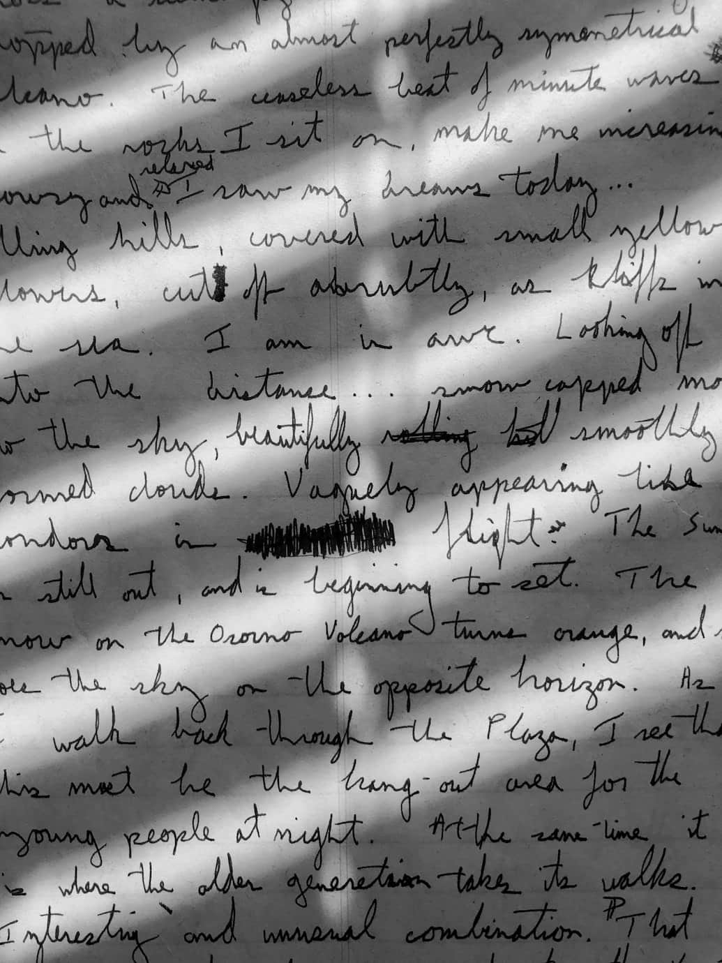
Input: A close-up photo of a page of handwritten cursive notes, with diagonal window-blind shadow stripes falling across the paper, darkening parts of the text while leaving other lines fully lit.
- Contrast44%
- Letter spacing58%
- Overall legibility39%
Extracted Text
A handwritten travel-journal passage in dark ink: rolling hills "covered with small yellow flowers", snow-capped mountains, and "the snow on the Osorno Volcano turns orange" at sunset, then a walk back through the plaza. A few words are crossed out and one is scribbled over completely, so it can't be read.
Contrast
The diagonal shadow stripes from window blinds cut contrast sharply in places, some lines sit in near-full shadow and become very hard to distinguish from the paper, while adjacent lit lines read clearly. This uneven lighting is the biggest legibility problem here, more than the handwriting itself.
Letter Formation and Spacing
The mixed print-and-cursive hand has tight, looping letterforms with inconsistent spacing between words, common in fast handwriting. Several letters (like 'e' and 'l') are easy to confuse where lines run together.
Recommendations
- Rephotograph in even, diffuse light without direct shadows crossing the page.
- Increase spacing between lines if this is being transcribed or retyped.
- Consider transcribing to a typed format if this needs to be broadly accessible.
How it works
- 1
Upload an image with visible text
Screenshots, scanned documents, photographed signage or handwritten pages all work. Capture the full area you want assessed at a resolution where the text is at least somewhat legible to your own eye.
- 2
The AI reads the text and its surroundings
It extracts what's written, then evaluates font size and style, color contrast against the background, letter and line spacing, and whether anything is overlapping or obstructing the words.
- 3
You get a scored breakdown
The response covers contrast against WCAG-style benchmarks, spacing issues, and overall legibility, with scores so you can see at a glance where the biggest problems are.
- 4
Ask about a specific audience or use case
Use the details box to ask, for example, whether the text would be legible for someone with low vision, or how it reads from a distance on a printed sign.
Use cases
Checking a flyer or poster before printing
Catch low-contrast text or cramped spacing on a print layout before it goes to the printer and can't be easily fixed.
Reviewing presentation slides
Test whether slide text will actually be legible from the back of a room, not just up close on your laptop screen.
Digitizing scanned handwritten notes
Get a sense of how legible a scanned or photographed handwritten page is before sharing it or relying on it for reference.
Testing website text as an image
Upload a screenshot of a hero section or banner to check color contrast against a background image or gradient.
Verifying signage from a distance
Check a photo of a sign or label for how well it would read to someone walking past rather than standing right in front of it.
Tips for better results
- Photograph text in even, diffuse lighting and avoid shadows falling across the page.
- Keep busy patterned backgrounds away from text you want to check for contrast.
- Remember the WCAG AA benchmark is a contrast ratio of 4.5 to 1 for body text; the 0 to 100 score here is an estimate, not that ratio, so confirm with a contrast checker on the source file.
- Increase font size for captions and labels that are meant to be read quickly or from a distance.
- Avoid heavily decorative or cursive fonts for anything that needs to be broadly legible.
- Re-upload after making a change to confirm the fix actually improved the score rather than assuming it did.
Limitations
This tool gives a visual estimate of readability based on what's in the image, not a certified WCAG contrast measurement with exact ratios. Photo quality, compression, lighting and camera angle can all affect the score, so a low reading might reflect the photo rather than the original text, and a high reading isn't a guarantee of accessibility compliance. For anything with legal accessibility requirements, confirm with a dedicated contrast checker on the actual source file and, where it matters, an accessibility professional.
Frequently asked questions
Can this tool check handwriting as well as typed text?
Yes. It reads and assesses handwritten text the same way it does printed or digital text, though very stylized or cramped handwriting will typically score lower on legibility.
Does a good score mean the image meets WCAG standards?
Not automatically. This is a visual estimate meant to catch obvious problems, not a certified compliance test. Use a dedicated contrast tool on your source file for formal accessibility sign-off.
What kinds of images work best?
Screenshots, scanned documents, photographed signage and handwritten pages all work, as long as the text is captured clearly enough to read at all in the original photo.
Can it tell me the exact font being used?
It can describe general style, such as serif, sans-serif or script, but it won't identify the specific font name from an image alone.
Will it fix the readability issues it finds?
No, this tool only analyzes and describes issues. Use its recommendations to adjust the original file, then re-upload the updated version to check your progress.
Why did two similar photos get different scores?
Lighting, angle, resolution and compression all affect what the AI can read, so small differences between two photos of the same text can change the score noticeably.
Plans start at $9 a month. See pricing