AI Data Visualization Analyzer
Upload a chart, graph or dashboard screenshot and get a professional read on what's working and what isn't.
What the Data Visualization Analyzer does
A chart that makes sense to the person who built it can still confuse everyone else in the room. Upload a photo or screenshot of a chart, graph, or dashboard and the AI gives you an outside read: what kind of chart it is, whether the axes and labels are clear, whether the colors are doing useful work or just decorating, and what to change before you present it. It's meant for the moment before you send a slide deck or report out the door, when you want a second opinion but don't have a data-viz specialist on hand. You can drop a note in the details box if you want it to focus on a particular audience or use case.
See a sample result
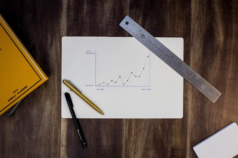
Input: A hand-drawn line chart on a notebook page, sketched in pen. The y-axis runs from "sucking" at the bottom to "not sucking" at the top, and the x-axis runs from "the past" to "the future." A jagged line of plotted points trends generally upward toward the right. A metal ruler, two pens, and the edge of a yellow planner sit next to the notebook.
- Clarity62%
- Labeling28%
- Color encoding55%
- Overall effectiveness48%
Chart type: A hand-drawn line chart plotting a single trend over time.
Clarity: The upward trend reads clearly at a glance, and the sketchy style makes the point in an intentionally informal way, but there are no numeric values on either axis, so the actual scale of "the past" to "the future" is undefined.
Labeling: The axis titles are playful rather than literal ("sucking" to "not sucking"), which works for a motivational note but wouldn't hold up as a real data label. There's no chart title or units.
Color encoding: The chart is monochrome, which is appropriate here since there's only one series and no categories to distinguish.
Recommendation: If this is meant as a personal reminder or a motivational sketch, it works as-is. If you intend to formalize it, add a real time axis, a numeric or ordinal y-axis, and a short title stating what's actually being tracked.
How it works
- 1
Upload a photo or screenshot of the chart
A phone photo of a whiteboard sketch, a screenshot from a dashboard, or an exported chart image all work. Make sure axis labels and any legend are visible in the frame.
- 2
Add context if it matters
Use the details box to say who the chart is for, such as "this is for executives" or "this is a student assignment," so the feedback matches the audience.
- 3
The AI reads the chart type and encoding
It identifies whether it's a line, bar, scatter or other chart type, checks how data is encoded through position, color and shape, and evaluates whether that encoding matches the data being shown.
- 4
Get a breakdown with scores and fixes
You get written feedback on clarity, color choices and labeling, plus 0 to 100 scores and specific changes to make before you share it.
Use cases
Checking a slide before a presentation
Run a chart through before it goes in front of stakeholders, to catch a missing axis label or a color scheme that doesn't read well when projected.
Reviewing a student's chart for an assignment
Get a quick, specific critique of a homework chart, pointing at concrete fixes rather than a vague grade.
Sanity-checking a dashboard screenshot
Paste in a screenshot of a live dashboard to see whether the color encoding or chart type actually fits the data it's showing.
Improving a blog post or report graphic
Before publishing a chart in an article, check whether the labeling and color choices will make sense to a reader seeing it cold.
Comparing a redesign against the original
Run both versions of a chart through the tool and compare the scores and feedback to see whether a redesign actually improved clarity.
Tips for better results
- Include the full chart in frame, with axis labels, legend and title all visible.
- Photograph screens straight-on to avoid glare and keyboard reflections washing out labels.
- Upload the highest-resolution version you have, since small text in a low-res screenshot can be misread.
- Mention the intended audience in the details box for more relevant feedback.
- If a chart has multiple panels, upload one panel at a time for a more focused read.
Limitations
This tool gives design and clarity feedback based on what it can see in the image; it doesn't verify the underlying data or recalculate any values. Handwritten or stylized charts, like a sketch or infographic, are read more loosely than a clean digital export, so feedback on those leans more toward tone than technical accuracy.
Frequently asked questions
Can it read the actual numbers in my chart?
It can describe approximate trends and values it can visually make out, but it isn't extracting exact data points or doing calculations. For precise numbers, work from your original data source.
Does it work on hand-drawn sketches, not just software charts?
Yes. It will identify the chart type and comment on clarity and labeling for a hand-drawn sketch, though feedback is naturally less technical than for a polished digital chart.
What chart types can it recognize?
Common types like line, bar, scatter, pie and area charts, along with more complex dashboards containing several charts at once.
Will it tell me which chart type I should have used instead?
Yes, if the current chart type doesn't fit the data well, the feedback will suggest a better-suited alternative and explain why.
Can I upload a screenshot of a spreadsheet chart?
Yes, a screenshot from Excel, Sheets, or a BI tool works the same as an exported image, as long as the chart and its labels are clearly visible.
Can I check several charts in one run?
Each analysis reads one image and uses credits from your plan, so check the charts that matter most, one per run. The pricing page shows current credit costs.
Plans start at $9 a month. See pricing